Use the Usercentrics SDK to create advanced banner designs and runtime variants. You can also use A/B testing and dark mode.
Supportability
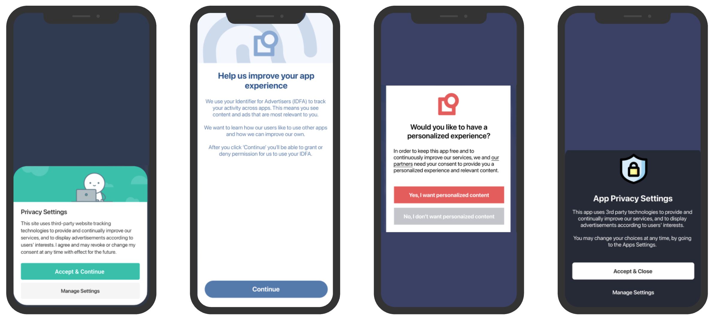
The functionalities described on this page are only applicable for prebuilt banners available on Android or iOS.
Compliance note
Because the Core module enables many customization options, it is important that your Data Protection Officer (DPO) reviews and approves the compliance of your design, e.g.:
A user must always have clear options to accept, deny or save granular choices available as call to actions in the first or second layer.
The first layer should always allow a path to the second layer.
Calls to action must be equally prominent.
The following sections explain how to use the Core module’s method to implement your design with the prebuilt banner.
Using BannerSettings to configure the banner
When creating the UsercentricsUI banner, a BannerSettings property will be available for you to customize any element of the banner.
BannerSettings is an optional field for the UsercentricsBanner constructor and an optional argument for the showFirstLayer and showSecondLayer methods.
let firstLayerStyleSettings = FirstLayerStyleSettings(
    buttonLayout =  [
        ButtonSettings(type: .acceptAll, font: UIFont(name: "Avenir", size: 15), cornerRadius: 18)
    ]
)
let bannerSettings = BannerSettings(generalStyleSettings: nil, //GeneralStyleSettings?
                                    firstLayerSettings: firstLayerStyleSettings,
                                    secondLayerSettings: nil //SecondLayerStyleSettings?)
let banner = UsercentricsBanner(bannerSettings: bannerSettings)
val firstLayerStyleSettings = FirstLayerStyleSettings(
buttonLayout = ButtonLayout.Column(
listOf(
ButtonSettings(
type = ButtonType.ACCEPT_ALL,
textColor = Color.Red,
backgroundColor = Color.Blue,
cornerRadius = 24,
textSizeInSp = 15f,
)
)
)
)
val bannerSettings = BannerSettings(
generalStyleSettings = null, //GeneralStyleSettings?
firstLayerSettings = firstLayerStyleSettings,
secondLayerSettings = null, //SecondLayerStyleSettings?
)
val banner = UsercentricsBanner(context, bannerSettings)final firstLayerStyleSettings = FirstLayerStyleSettings(
buttonLayout: ButtonLayout.column(buttons: [
const ButtonSettings(
type: ButtonType.acceptAll,
textColor: Colors.black,
backgroundColor: Colors.white,
textSize: 16.0,
cornerRadius: 32.0,
),
])
)
final bannerSettings = BannerSettings(
general: null, //GeneralStyleSettings?
firstLayer: firstLayerStyleSettings,
secondLayer: null, //SecondLayerStyleSettings?,
);
// First Layer
final response = await Usercentrics.showFirstLayer(
settings: bannerSettings,
);
// Second Layer
final response = await Usercentrics.showSecondLayer(
settings: bannerSettings,
);const bannerSettings: BannerSettings = {
firstLayerStyleSettings: {
buttonLayout: ButtonLayout.row([
{
buttonType: ButtonType.acceptAll,
cornerRadius: 30.0,
backgroundColorHex: "FFFFFF",
textSize: 16.0,
textColorHex: "000000",
}
])
},
secondLayerStyleSettings: null, //SecondLayerStyleSettings?
generalStyleSettings: null //GeneralStyleSettings?
}
// First Layer
const response = await Usercentrics.showFirstLayer(bannerSettings);
// Second Layer
const response = await Usercentrics.showSecondLayer(bannerSettings);var bannerSettings = BannerSettings(generalStyleSettings: new GeneralStyleSettings(),
firstLayerStyleSettings: new FirstLayerStyleSettings(),
secondLayerStyleSettings: new SecondLayerStyleSettings());Programmatically set values overwrite style settings you define in the Admin Interface.
Dark mode
To use light and dark theme, create two BannerSettings, and display the right one according to the mode used on the device. Example:
let lightBannerTheme = BannerSettings(...) // define light theme
let darkBannerTheme = BannerSettings(...) // define dark theme
let theme = (<Device Theme Dark?>) = darkBannerTheme : lightBannerTheme
let banner = UsercentricsBanner(theme)
banner.showFirstLayer(hostView: self) { }
General style settings properties
The following properties are available to customize the general banner style for iOS, Android, Flutter and React Native:
Properties | Type | Notes |
|---|---|---|
bordersColor | Color | Edit the color for the borders of the Category and Services content section, Category and Service components and Service Information Tags. |
disableSystemBackButton | Bool | Disable system back button. |
font | Font | Pass both Regular and Bold fonts to be used in the banner. |
layerBackgroundColor | Color | Edit the color of the First Layer, and Header and Footer of the Second Layer. |
layerBackgroundSecondaryColor | Color | Edit the color of the background in the content section. |
linkColor | Color | Edit the color of all available links. |
links | Enum | Customize the visibility of the legal links: .both (default), .firstLayerOnly, .secondLayerOnly and .hidden. |
logo | Image | Pass a local image to be rendered as a logo in both First Layer and Second Layer. |
statusBarColor | Color | Edit the color of the status bar when the banner is displayed. |
tabColor | Color | Edit the color of the Category and Services Tabs. |
textColor | Color | Edit the text color for both First Layer and Second Layer. |
toggleStyleSettings | Object | Edit the toggle colors for: Active, Inactive and Disabled states. |
windowFullscreen | Bool | Enable/Disable Banner in fullscreen mode. |
The properties to customize general style settings for the banner in Unity are the following:
Properties | Type | Notes |
|---|---|---|
androidDisableSystemBackButton | Bool | Disable Android system back button. |
androidStatusBarColor | String | Android status bar color represented in HEX. |
androidWindowFullscreen | Bool | Enable/Disable Banner in fullscreen mode. |
bordersColor | Color | Edit the color for the borders of the Category and Services content section, Category and Service components and Service Information Tags. |
layerBackgroundColor | Color | Edit the color of the First Layer, and Header and Footer of the Second Layer. |
layerBackgroundSecondaryColor | Color | Edit the color of the background in the content section. |
linkColor | Color | Edit the color of all available links. |
links | Enum | Customize the visibility of the legal links: .both (default), .firstLayerOnly, .secondLayerOnly and .hidden. |
logoImageUrl | String | Pass an image URL to be rendered as a logo in both First Layer and Second Layer. |
tabColor | Color | Edit the color of the Category and Services Tabs. |
textColor | Color | Edit the text color for both First Layer and Second Layer. |
toggleStyleSettings | Object | Edit the toggle colors for: Active, Inactive and Disabled states. |
First layer style settings properties
The following properties are available to customize the first layer style for iOS, Android, Flutter, React Native and Unity:
Properties | Type | Notes |
|---|---|---|
backgroundColor | Color | Edit the color of the First Layer background. |
buttonLayout | Enum | Customize the layout of the action buttons: .column (default), .grid, .row. You may also pass an array of ButtonSettings to define the order and appearance of the buttons. |
cornerRadius | Float | Edit the corner radius of the banner. |
headerImage | Enum | Customize the layout of the image at the top of your banner: .logo (default), .extended or .hidden. |
layout | Enum | Select the Layout of the First Layer: Sheet, Popup Center, Popup Bottom, Full. |
message | Object | Customize the appearance of the message label: Font, Text Size, Text Color, Text Alignment, Link Text Color and Link Text Underline. |
(only for Unity) overlayAlpha | Float | Edit the alpha of the overlay color. |
overlayColor | Color | Edit the color of the First Layer overlay. |
title | Object | Customize the appearance of the title label: Font, Text Size, Text Color and Text Alignment. |
Second layer style settings properties
The following properties are available to customize the second layer style for iOS, Android, Flutter, React Native and Unity:
Properties | Type | Notes |
|---|---|---|
(not available in Unity) | Enum | Customize the layout of the action buttons: .column (default), .grid, .row. You may also pass an array of ButtonSettings to define the order and appearance of the buttons. |
showCloseButton | Bool | Show a close button in the Second Layer to allow users to dismiss the banner without editing consent. |
Button settings properties
The following properties are available to customize button settings.
Properties | Type | Notes |
|---|---|---|
type | Enum | Select the Button Type: Accept All, Deny All, More, Save. |
font | Font | Customize the Font of the Button text. |
backgroundColor | Color | Edit the color of the Button background. |
textColor | Color | Edit the color of the Button text. |
textSizeInSp | Float | Edit the size of the Button text in Scalable Pixels (adjustable to the device screen density and users preference). |
cornerRadius | Int | Edit the corner radius of the Button. |
isAllCaps | Boolean | Change the Button text to be in all Uppercase. |
Accessibility
The text size within any font-utilizing sections (such as GeneralStyleSettings, TitleSettings and MessageSettings) is influenced by the device's accessibility settings. In this scenario, Usercentrics SDK automatically adjusts the font size specified in the Admin Interface, by the factor determined in the accessibility settings of the respective device (prebuilt banner on Android or iOS).
Customize fonts on iOS
On iOS, when setting a font programmatically (e.g., GeneralStyleSettings), the banner won't adhere to the accessibility settings specified on the device unless a scaled font is used. Ensure that you pass a scaled font to conform to accessibility rules.
Example:
let fontMetrics = UIFontMetrics.default
let scaledFont = BannerFont(regularFont: fontMetrics.scaledFont(for: UIFont(...)), boldFont: fontMetrics.scaledFont(for: UIFont(...))
let generalStyleSettings = GeneralStyleSettings(font: scaledFont)
Default behavior
When no font is specified, the SDK defaults to the system font and the size set in the Admin Interface, ensuring compliance with accessibility standards.
Customize fonts on Android
On Android, the operating system consistently respects the device's accessibility settings, regardless of the selected font size.