This feature is available only in the Premium Web, Enterprise, Business and Corporate subscriptions. Learn more about the available features on the pricing page.
Script tag version
This documentation applies only if you are using V3 script tag on your website.
Applying CSS changes
Disclaimer
By using Custom CSS, you will be in control of your custom UI. Your CSS adjustments will affect the layout of your CMP and possibly also of your website. You'll make these adjustments at your own risk and outside of the sphere of the Usercentrics support.
To enable custom CSS, follow these steps:
Open the Usercentrics Admin Interface
Navigate to Appearance - Styling.
Add your CSS code into the 'Custom CSS' field.
Custom CSS is not parsed in any way, but is directly embedded within a <style> tag in the Shadow DOM housing the CMP.
Entry points
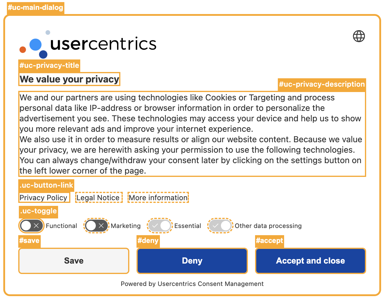
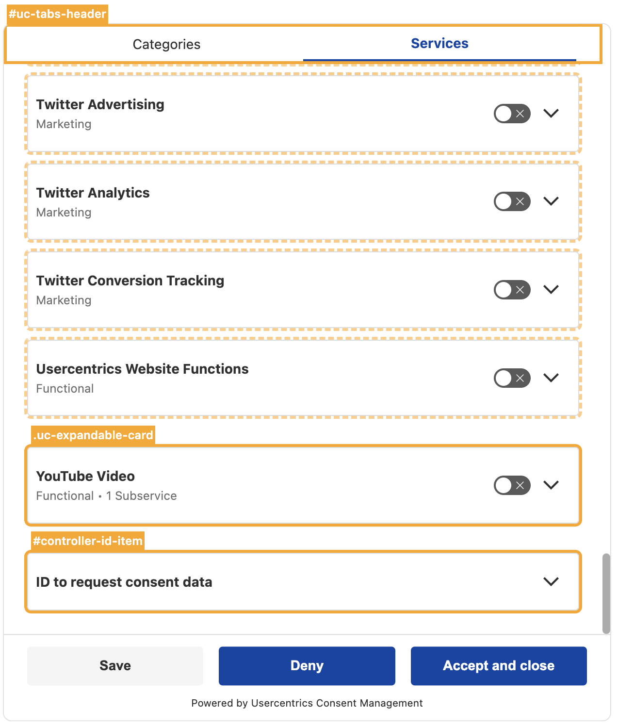
CMP
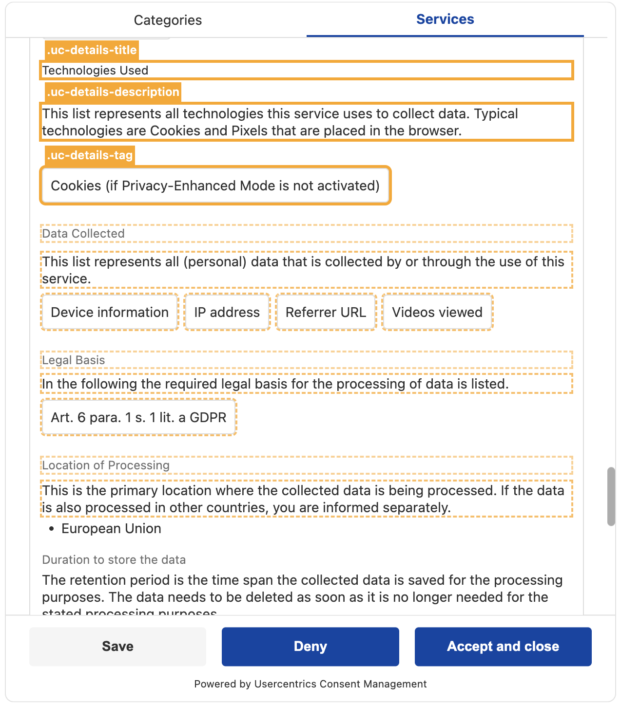
The following selectors can be modified within the CMP:
References the floating privacy button that reopens the CMP
—
Hover-Specific Classes
It is also possible to define the Hover Style for specific classes. For example:
#accept:hover {
    background-color: #d9249d;
}
Service modal
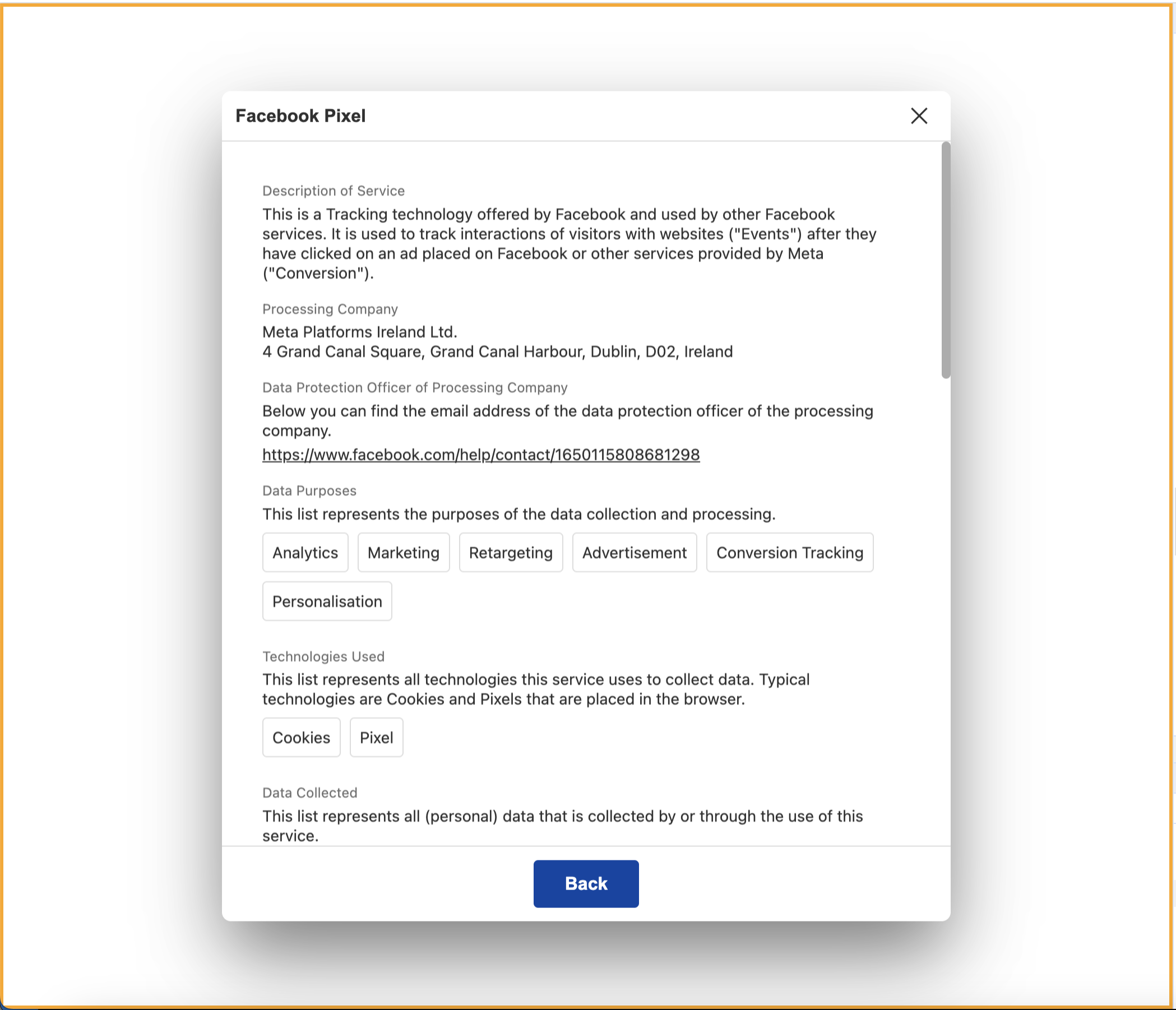
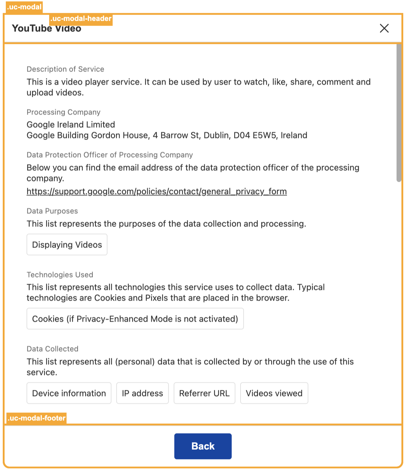
When a service or subservice is opened in a standalone view, a modal is generated for this specific purpose. Multiple modals can be open at the same time and they share their internal structure with the expandable cards within the CMP. As a result, .uc-details-[..] namespaced selectors such as .uc-details-title and .uc-details-description are also applicable within this context. The modal-specfic entry points are:
The floating privacy button that lets users reopen the CMP is rendered inside the same #uc-main-dialog container as the rest of the CMP, using .privacyButton as its layer-equivalent class (see Conditional styling). The clickable button itself is targeted separately via #uc-privacy-button.
Migrating from V2
In CMP V2, the floating privacy button was targeted with the class .uc-privacy-button. In V3, that class no longer exists — use the ID selector #uc-privacy-button for the button, and #uc-main-dialog.privacyButton for its container.
CSS Selector
Description
#uc-main-dialog.privacyButton
References the privacy button's outer container
#uc-privacy-button
References the clickable privacy button itself
#uc-main-dialog.privacyButton.desktop {
    /* Custom CSS styles for the privacy button container on desktop */
}

#uc-privacy-button {
    /* Custom CSS styles for the privacy button itself, e.g. size, background color */
}
Info
Read more about how to style both the CMP and modals conditionally under Conditional styling
Tip
Custom CSS can technically be applied to any element; however, these predefined entry points are provided to streamline the customization process for your convenience.
Conditional styling
The selector #uc-main-dialog designates the primary container within the CMP.
Illustration
This container may have additional classes that allow for the targeting of elements on specific CMP layers or under specific device and configuration conditions. To apply CSS targeting based on devices or layers, these classes can be concatenated with the selector for the main container. The following classes represent various device-related criteria, layer distinctions, language direction, and framework indicators available for customization on the main dialog container.
Devices
Class
Screen size
Breakpoint
.xs
Extra small
< 360 px
.mobile
Small
> 360 px
.tablet
Medium
> 768 px
.desktop
Large
> 1024 px
Layers
Class
Layer name
.first
First layer
.second
Second layer
.privacyButton
Floating privacy button
Language direction
Class
Language Direction
.ltr
Left-to-Right
.rtl
Right-to-Left
Framework indicator
Class
Legal Framework
.gdpr
General Data Protection Regulation (GDPR)
.tcf
Transparency and Consent Framework (TCF)
.us
US state privacy laws (CCPA/CPRA and other US state laws)
GPC message
The GPC message appears when the banner recognizes a GPC signal.
Id
Description
#uc-gpc-signal
Wrapper for the message
#uc-gpc-icon
Icon for the message
#uc-gpc-text
Text of the message
Examples (CMP)
#uc-main-dialog.mobile.second {
    /* Custom CSS styles for the cmp container on the second layer on mobile devices */
    /* Add your styles here */
}
To direct your styling towards a specific element within the CMP on a particular device, you can use the device modifier by attaching it to the main container as the root targeting element.
#uc-main-dialog.tablet .uc-expandable-card {
    /* Custom CSS styles for expandable cards on tablet */
    /* Add your styles here */
}
Service modal
The selector .uc-modal-overlay designates every primary modal wrapper.
Illustration
The service modal elements exist as standalone components outside the primary CMP container. As a result, the device-related classes are also present on the modal wrappers.
Examples (Modal)
.uc-modal-overlay.desktop .uc-details-title {
    /* Custom CSS styles for modal service section titles on desktop */
    /* Add your styles here */
}

.uc-modal-footer button {
    /* Custom CSS styles for the modal footer button */
    /* Add your styles here */
}
Tip
The usage of the device modifier is optional, as you can place your own media queries for precise screen targeting within Custom CSS if this is more suitable.