
At a Glance
- Dark patterns are deceptive interface design tactics that exploit cognitive biases, pushing website visitors toward decisions they would not otherwise make, such as sharing personal data, accepting unwanted subscriptions, or paying hidden fees.
- Common forms include hidden costs, forced continuity, confirmshaming, privacy Zuckering, misdirection, and relentless repeated requests.
- In 2023, the European Data Protection Board (EDPB) finalised Guidelines 03/2022, establishing six categories of dark patterns under the GDPR: overloading, skipping, stirring, obstructing, fickle, and left in the dark.
- The EU’s Digital Services Act (DSA), fully applicable from February 2024, explicitly prohibits dark patterns across online platforms for the first time in EU law.
- In the U.S., the FTC’s 2022 report Bringing Dark Patterns to Light classified dark patterns as unfair or deceptive practices. Enforcement has since escalated, culminating in a USD 2.5 billion settlement with Amazon in September 2025.
- Businesses that replace deceptive design with transparent, user-centred consent practices can reduce regulatory exposure while building measurable, long-term consumer trust.
Good user experience (UX) design should make digital experiences intuitive and user-friendly. However, some companies use deceptive tactics to influence user decisions. These tactics, known as nudging or dark patterns, can exploit cognitive biases to manipulate visitors into taking actions they did not intend, like subscribing to unwanted services, sharing personal data, or making unnecessary purchases.
Understanding how dark patterns work can help marketers avoid these practices, and enable companies to create ethical designs and avoid regulatory risks.
What Is a Dark Pattern?
The term “dark pattern” was coined by London-based UX designer Harry Brignull. He defines a dark pattern as, “a type of user interface that appears to have been carefully crafted to trick users into doing things that are not in their interest and is usually at their expense.”
At their core, dark patterns exploit cognitive biases. They leverage the way our brains process information to nudge us toward specific decisions, often against our best interests.
These deceptive design tactics can pop up across websites, forms, emails, and apps. They are designed to trick or pressure users into doing things they may not have meant to do, or even things they actively wanted to avoid. Instead of using clear communication or fair persuasion, they manipulate users into giving up data, staying on a site, or keeping a subscription.
Types of Dark Patterns
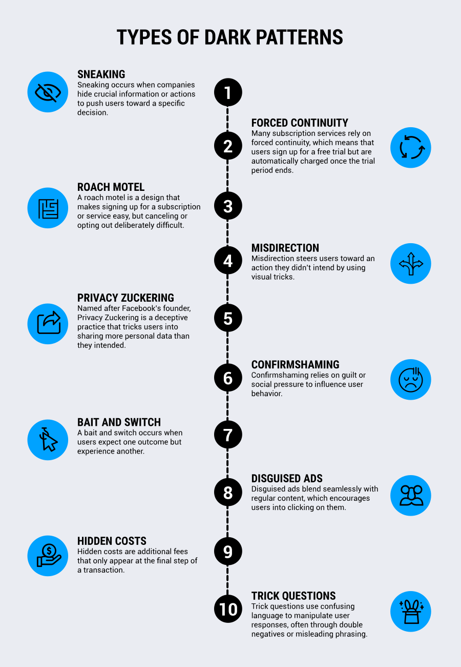
Dark patterns take many forms, and different sources may categorize them in various ways. Below, we’ve outlined the dark patterns that are the most commonly used. Each is designed to manipulate users into making choices that benefit the company rather than the user.
Sneaking
Sneaking occurs when companies hide crucial information or actions to push users toward a specific decision. It can take many forms, such as hidden fees that only appear at checkout, automatic signups for paid services without obtaining clear consent, or pre-selected checkboxes that commit users to unwanted subscriptions. The goal is to get users to agree to something without realizing it until it’s too late.
Forced Continuity
Many subscription services rely on forced continuity, which means that users sign up for a free trial but are automatically charged once the trial period ends. Often, these services provide little to no warning before billing begins and make cancellation difficult.
Instead of a simple “Cancel” button, users might have to navigate a complex process involving multiple confirmation steps or even direct customer service interactions.
Roach Motel
A roach motel is a design that makes signing up for a subscription or service easy, but canceling or opting out deliberately difficult. Users may find themselves jumping through hoops, since as contacting support, mailing a cancellation request, navigating a maze of menu options, etc. just to leave a service. The inconvenience discourages cancellations and prolongs unwanted subscriptions.
Misdirection
Misdirection steers users toward an action they didn’t intend by using visual tricks. An example of this dark pattern might be a brightly colored “Subscribe” button that is positioned prominently, while the option to opt out is smaller, less visible, only an unobtrusive text link, or written in a confusing way. This tactic plays on user expectations, nudging them toward decisions they might not have made otherwise.
Privacy Zuckering
Named after Facebook’s founder, Privacy Zuckering is a deceptive practice that tricks users into sharing more personal data than they intended. This often happens through misleading privacy settings, vague descriptions of data usage, or default options that enable extensive tracking and data collection. Users may believe they are protecting their privacy, only to discover later that they unknowingly consented to extensive data sharing.
Confirmshaming
Confirmshaming relies on guilt or social pressure to influence user behavior. This tactic is commonly seen in pop-ups that present declining an offer in a negative light.
For example, a website might prompt users with a message like, “No thanks, I prefer to stay uninformed” when they try to reject a newsletter subscription, or “That’s okay, I like paying full price” if a prospect declines to sign up for something when offered a discount. The goal is to make users feel guilty or ashamed about their decision and reconsider.
Bait and Switch
A bait and switch occurs when users expect one outcome but experience another. A common example is a button that appears to close a pop-up but instead triggers a sign-up or redirects the user to an unrelated page. This deceptive approach exploits user expectations to drive engagement in misleading ways.
Disguised Ads
Disguised ads blend seamlessly with regular content, which encourages users into clicking on them. They may appear as recommended articles, in-site navigation elements, or even user generated content. Because they mimic real content, users engage with them without realizing they are advertisements.
Hidden Costs
Hidden costs are additional fees that only appear at the final step of a transaction. A user might add an item to their cart expecting a certain total, only to discover extra charges right before check out, such as processing fees, mandatory add-ons, or inflated shipping costs. By revealing these costs late in the process, companies increase the likelihood that users will proceed with the purchase rather than abandon it.
Trick Questions
Trick questions use confusing language to manipulate user responses, often through double negatives or misleading phrasing.
For example, a form might include a checkbox labeled “Uncheck this box if you don’t want to receive promotional emails.” This type of wording may confuse users, increasing the chance they will make an unintended selection.
Relentless Repeated Requests
A more recent tactic involves offering a markedly better experience to visitors who comply with a platform’s data requests, while subjecting those who decline to persistent, disruptive re-prompting. A visitor who accepts targeted advertising sees no further interruption; one who declines may encounter the same consent request every time they use the service.
The EDPB’s Guidelines 03/2022 classify this pattern under “overloading” — specifically, the sub-type known as continuous prompting — and note that it can erode meaningful consent by wearing down resistance rather than genuinely obtaining agreement.
For example, a user opens a new app and sees a banner requesting consent for targeted advertising. If they accept, they never see the banner again. But if they decline, the banner reappears every time they attempt to use the app. In the case of BeReal, which has since shut down, users were encouraged to use the app multiple times a day, leading to significant likely frustration.
How Do Dark Patterns Work?
Dark patterns take advantage of how humans process information. They exploit cognitive biases, mental shortcuts that help us make decisions quickly, but that can also lead to manipulation.
For example, the “default effect” makes people more likely to stick with pre-selected options. That’s why companies often use pre-checked boxes for newsletter signups or data-sharing permissions. Users may not notice these settings or assume they are necessary.
Similarly, dark patterns use urgency and scarcity to make people worry that they are missing out on something. Fake countdown timers or messages like “only two left in stock” create artificial pressure, nudging users to act impulsively.
These tactics can lead to unintentional purchases, privacy violations, and frustration. So, while they may initially benefit the business, they also damage trust in the long run.
Dark Patterns Examples
Dark patterns are more common than you may think. A European Commission study from 2018 found that 97 percent of the most popular websites and apps used at least one deceptive design tactic to manipulate users.
The numbers improved a bit with time, with the Federal Trade Commission (FTC) in the U.S., as well as the International Consumer Protection and Enforcement Network (ICPEN) and Global Privacy Enforcement Network (GPEN) discovering in 2024 that 75.7 percent of 642 companies’ sites and apps used least one dark pattern, with 66.8 percent using two or more.
Regulatory attention has intensified substantially since then. A 2022 study commissioned by the European Commission found that 97 percent of the most popular websites and apps used by EU consumers deployed at least one dark pattern, with the most common practices involving:
- Hiding information
- Creating false hierarchies in choice architectures
- Repeated prompting
- Difficult cancellations
- Forced registrations
A separate sweep of 399 retail websites by EU consumer protection authorities found that nearly 40 percent of online shopping websites rely on manipulative practices to exploit consumer vulnerabilities.
Whether it’s making subscriptions hard to cancel, sneaking in extra fees, or creating fake urgency for purchases, these tactics are designed to push people into decisions they wouldn’t necessarily normally make.
Here are three real-world dark pattern examples.
Amazon’s Prime Cancellation Process
Amazon’s Prime cancellation process became one of the defining dark pattern enforcement cases of the decade. For years, cancelling a Prime subscription required navigating what Amazon employees internally called the “Iliad Flow” (a reference to Homer’s epic) a multi-page process involving reminders about Prime benefits, deliberately ambiguous buttons, and repeated attempts to dissuade the visitor from leaving.
On September 25, 2025, Amazon agreed to pay USD 2.5 billion to settle claims brought by the FTC alleging that the company misled consumers into signing up for Prime memberships and made it difficult for them to cancel.
The settlement requires Amazon to pay a USD 1 billion civil penalty — the largest ever in a case involving an FTC rule violation — and USD 1.5 billion in consumer redress. Amazon was also required to redesign its sign-up and cancellation flows to include clear, upfront disclosures.
Internal documents revealed that Amazon employees had described unwanted Prime subscriptions as “an unspoken cancer” and acknowledged that simplified cancellation would “adversely affect Amazon’s bottom line.” The case illustrates that dark patterns are not merely a design ethics concern, but also carry material legal and financial risk.
Hidden Fees on Ticket Websites
Ticketing platforms, such as Ticketmaster, often advertise low prices upfront, only to reveal extra fees at checkout. A ticket listed at USD 50 might end up costing USD 80 or more after service charges, facility fees, and processing costs.
These hidden fees can add 20 percent or more to a ticket’s price, with some platforms charging an extra USD 30–60 per ticket, plus handling fees. It’s also not necessarily clear by the naming what some fees are even for.
By waiting until the final step to display the full cost, these platforms take advantage of users’ commitment to the purchase process.
Mobile Games Using Fake Urgency
Many mobile games use false urgency to encourage spending. They display limited time offers for in-game items, often with countdown timers suggesting the deal will disappear soon.
However, when the timer runs out, the same or a nearly identical offer usually appears again. This tactic creates the illusion of scarcity, pressuring players into impulse purchases, even though the offer was never truly limited.
Laws and Regulations Governing Dark Patterns
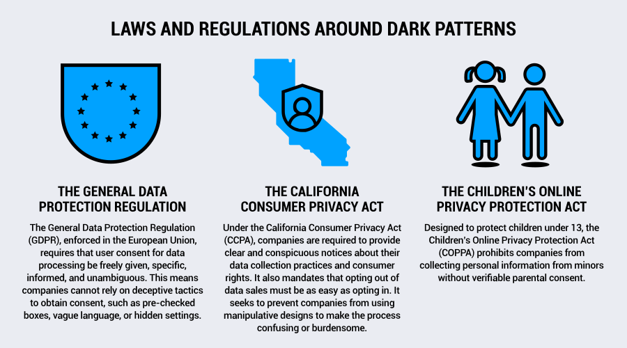
Governments and regulators worldwide have begun taking action against deceptive UX practices and dark patterns in advertising. Regulations are being implemented to enforce stricter rules and protect users from manipulation.
Several key regulations specifically address dark patterns. We’ll cover these below.
The General Data Protection Regulation (GDPR)
The General Data Protection Regulation (GDPR), enforced in the European Union, requires that user consent for data processing be freely given, specific, informed, and unambiguous. This means companies cannot rely on deceptive tactics to obtain consent, such as pre-checked boxes, vague language, or hidden settings.
Dark patterns that pressure users into agreeing to data collection are considered a violation of the GDPR and can result in hefty fines. These tactics can include misleading button designs or confusing opt-out options.
EDPB Guidelines on Deceptive Design Patterns
In March 2022, the European Data Protection Board (EDPB) published dedicated guidance addressing dark patterns directly. The guidelines were finalized as “Guidelines 03/2022 on Deceptive Design Patterns in Social Media Platform Interfaces” in February 2023.
While the guidelines focus on social media platforms, the EDPB has made clear that the underlying GDPR principles, and in particular the requirements for fair and transparent processing under Article 5, apply across all sectors.
The EDPB provides a taxonomy of six defined categories of dark patterns:
- Overloading, which involves overwhelming visitors with an excess of requests or options to prompt data sharing
- Skipping, which involves designing interfaces so that visitors overlook data protection considerations
- Stirring, which involves appealing to emotions or using visual nudges
- Hindering, which involves obstructing visitors from accessing information or managing their data
- Fickle, which involves designing interfaces inconsistently to create confusion
- Left in the dark, which involves hiding information or data protection controls
These categories have practical implications for consent banner design. A banner that makes accepting cookies a single click while requiring multiple steps to reject them falls squarely within the “hindering” category. Color choices that make the “reject” option visually recessive relative to “accept” constitute “stirring.”
The Digital Services Act (DSA)
On 17 February 2024, the Digital Services Act (DSA) became directly applicable across the EU, explicitly codifying and prohibiting dark patterns in online interfaces for the first time in its Article 25.
The DSA states that “providers of online platforms shall not design, organize or operate their online interfaces in a way that deceives or manipulates the recipients of their service or in a way that otherwise materially distorts or impairs the ability of the recipients of their service to make free and informed decisions.”
The DSA’s prohibition on dark patterns expressly does not apply to practices already covered by the Unfair Commercial Practices Directive or the GDPR, but it adds a further enforcement tool, and opens the door to fines of up to 6 percent of a platform’s total global annual turnover. Current enforcement investigations have focused on Very Large Online Platforms (VLOPs) including Meta, Temu, and X.
Looking further ahead, the European Commission has confirmed plans to propose a Digital Fairness Act in the fourth quarter of 2026, aimed at further strengthening consumer protection against dark patterns, addictive design, and unfair personalization practices.
The California Consumer Privacy Act (CCPA)
Under the California Consumer Privacy Act (CCPA), companies are required to provide clear and conspicuous notices about their data collection practices and consumer rights. It also mandates that opting out of data sales must be as easy as opting in. It seeks to prevent companies from using manipulative designs to make the process confusing or burdensome.
The California Privacy Rights Act (CPRA), which amends and expands the CCPA, takes a stronger stance against dark patterns. It explicitly states that any interface designed to “subvert or impair” consumer choices regarding privacy rights is unlawful. This includes deceptive UI elements that discourage users from opting out of data collection, or those that make it unnecessarily difficult to delete personal information.
The California Privacy Protection Agency (CPPA) enforces these regulations and can issue hefty fines and penalties for non-compliance.
The Children’s Online Privacy Protection Act (COPPA)
Designed to protect children under 13, the Children’s Online Privacy Protection Act (COPPA) prohibits companies from collecting personal information from minors without verifiable parental consent.
Many dark patterns can violate this law. Examples include nudging children into sharing data, making unintended purchases through deceptive in-app mechanisms, or using manipulative design to encourage excessive screen time.
Companies that fail to comply with COPPA can face significant fines from the FTC, which has been increasingly aggressive in enforcing these protections.
FTC Enforcement in the United States
In the United States, the Federal Trade Commission has moved from guidance to active enforcement. In 2022, the FTC released its staff report Bringing Dark Patterns to Light, which detailed a wide range of deceptive design practices.
The report, and the FTC’s subsequent amendment to its Negative Option Rule, which requires cancellation mechanisms to be “at least as easy to use” as enrollment, underscore the agency’s commitment to treating dark patterns as unfair or deceptive practices under Section 5 of the FTC Act.
Enforcement has followed. In March 2023, the FTC required Epic Games to pay USD 245 million after it used confusing and inconsistent button configurations to trick Fortnite players into making unwanted in-game purchases.
In June 2023, Publishers Clearing House was required to pay USD 18.5 million for misleading consumers about sweepstakes entry requirements.
How to Avoid Dark Patterns
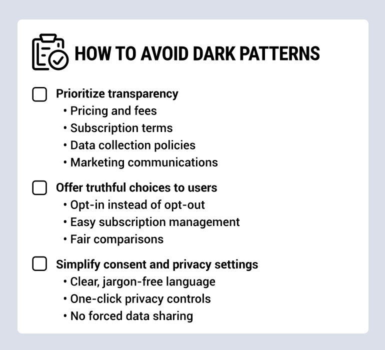
With regulations like the GDPR and the CPRA cracking down on deceptive UX practices, businesses need to go beyond bare minimum compliance and actively build trust with their users. Dark patterns might drive short-term gains, but they damage customer relationships, increase customer churn, and can even lead to legal consequences.
For marketers, designers, and enterprise companies, ethical design can help you avoid fines, but more importantly, it’ll help build long-term engagement, loyalty, and a positive brand reputation.
Here’s how to keep your UX transparent, fair, and user-friendly.
Prioritize Transparency
Transparency is key to maintaining user trust. When users feel informed and in control of their experience, they’re more likely to engage with your brand for the long term. This includes being up front about pricing, data collection, and subscription terms. Incomplete or deceptive information, whether it’s about costs or how data is handled, creates confusion and frustration. This often leads to users feeling manipulated.
Here are a few ways to prioritize transparency:
- Pricing and fees: Display total costs up front, including taxes, shipping, and recurring fees. Avoid hidden charges or last-minute surprises at check out.
- Subscription terms: Clearly outline renewal policies, trial expiration dates, and how to cancel. If a subscription auto-renews, make it explicit before the user signs up and send a reminder that renewal is coming up.
- Data collection policies: Use plain language to explain what data you collect, for what purposes, how it will be used, and what visitors’ rights are. Don’t bury privacy details in fine print.
- Marketing communications: Users should know when they are subscribing to emails, texts, or push notifications. Provide clarity by avoiding pre-checked boxes and deceptive consent prompts.
Offer Truthful Choices to Visitors
When users feel they have control over their decisions, they are more likely to trust and return to your brand. This means offering users genuine choices, rather than pushing towards decisions through hidden opt-outs or unnecessarily complex processes.
To offer truthful choices, follow these principles:
- Opt-in instead of opt-out: Users should actively choose to receive marketing emails, data tracking, or additional services. Requiring users to actively opt-out of unwanted services via default opt-ins is misleading and can violate privacy laws.
- Easy subscription management: The process for unsubscribing or canceling should be as simple as signing up. Avoid deterrents like hidden steps, long wait times, or forced calls to customer service.
- Fair comparisons: If your business offers multiple pricing plans, present them objectively instead of using design tricks to steer users toward a specific option.
Simplify Consent and Privacy Settings
Consent and privacy management should be simple and straightforward. Your website visitors should never feel overwhelmed by complex or confusing privacy settings, and following a privacy by design approach is always a good idea.
Here’s how you can simplify consent and privacy settings:
- Clear, jargon-free language: Avoid using complex legal terminology that users may not understand. Instead, use simple, direct language when explaining privacy policies or consent forms.
- One-click privacy controls: Enable users to adjust cookie settings, ad preferences, and data-sharing options with minimal steps.
- No forced data sharing: Give users access to basic features without requiring unnecessary personal information. Offer options to limit data sharing while still enjoying core functionalities.
Test for Ethical UX
Even with careful planning, designs may unintentionally mislead or frustrate users. To avoid dark patterns, regularly test your user experience and gather feedback. Continuous testing will help keep your platform user-friendly, transparent, and aligned with ethical principles.
To test for ethical UX, you can conduct:
- User testing and feedback: Conduct A/B testing, usability studies, and direct feedback sessions to identify any confusing or misleading design elements.
- Accessibility audits: Make it easy for users with disabilities to navigate and understand your platform. Meet standards like those from the WCAG. Ethical design includes inclusivity.
- Regular compliance reviews: Stay updated with global privacy regulations to help ensure your UX meets both legal and ethical standards.
Learn more about cookie banners and why you need one.
How a Consent Management Platform Can Help You Prevent Dark Patterns and Build Trust
Dark patterns may deliver quick wins, but they come at a high cost. Your business may face frustrated users, lost trust, and potential legal penalties. As consumers become more aware and regulations tighten, businesses that rely on these deceptive design tactics take a risky gamble, trading short-term gains for long-term damage.
But privacy compliance and data-driven success don’t have to be at odds. Businesses can collect the data they need while respecting user consent, fostering transparency, and building stronger customer relationships.
A consent management platform helps businesses by helping achieve and maintain compliance and enabling transparent data practices. Solutions like Usercentrics CMPs enable globally privacy-compliant cookie consent management and support a robust data privacy framework. We’ll help your business process data responsibly and ethically.

Join our growing community of data privacy enthusiasts now. Subscribe to the Usercentrics newsletter and get the latest updates right in your inbox.